
Designed in the Office of Graduate & Continuing Studies at PSU.
This is a collection of some of my favorite miscellaneous & unused artwork from my time working as a Graduate Assistant in the Office of Graduate & Continuing Studies at Pittsburg State University.
The Details
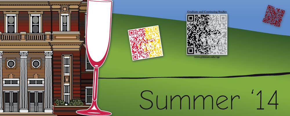
Let’s start with the QR-Codes. Messing with QR-Codes is kind of a thing I do. I see it as a challenge: How much can I do with this computer generated 2-deminsional code while still maintaining it’s effectiveness. Here are just a few I made while working in the Graduate Office.
The rounded-line design was originally made for use in the first version of the Graduate Viewbook. That version of the viewbook never made it to print because we decided to go a different route, but the QR-Code might have been used by other grad assistants in the office on other projects. It was sort of inspired by a similar QR-Code I saw at the Mall of America, though my design featured thinner lines and dots for unconnected squares in the code. The MoA version I saw also used diagonal lines. I liked this concept so much that I re-used the style in a QR-Code I made to promote my online radio station (SoupRadio.com).
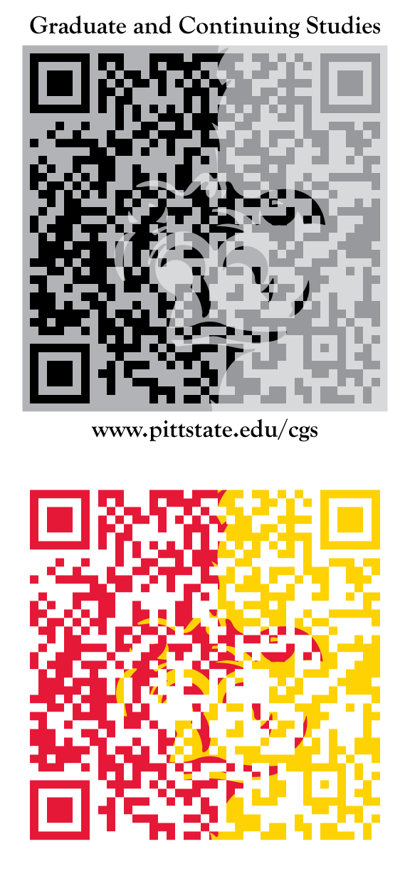
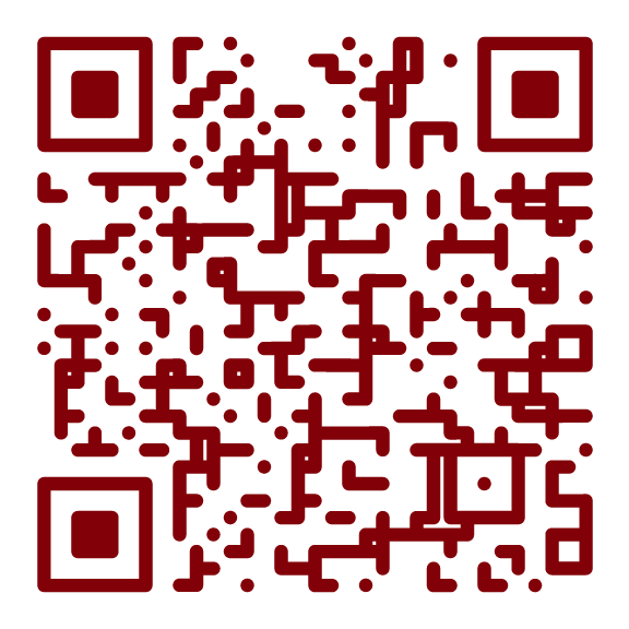
The other two QR-Codes infuse the Pitt State splitface logo into the code. These were more experiential, testing the readability of using multiple colors. The top one using the one color logo with a grey color filling in the normally white part of the logo. Then I reversed the logo into a transparent overlay creating 4 different grey colors. To get the code to scan, I had to tweak the colors a bit to make sure the light part on over the black side of the logo was lighter than the dark part over the grey side of the logo.
The 2 color code was similar process, just without making the overlay transparent. I did have to adjust the yellow color a bit to make it dark enough to register on the same side of the threshold as the red. Neither of these splitface QR-Codes were every used means they don’t even come close to PSU brand standards.
All 3 codes worked well on all the devices and apps I tested it with. These may have been created with little intent to use, but it was worth the time to discover different ways to manipulate QR-codes. I was often busy in the office, but in moments of downtime, I felt free and encouraged to experiment with creative ideas.
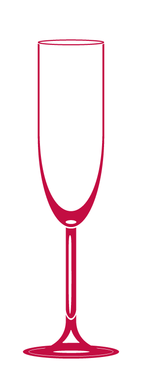
This champagne glass was originally designed for an alternative cover of the 2014 Graduate and Research Awards Banquet program. I made quite a lot of Illustrator artwork in the office, but there’s something about this simple vector representation that I find really appealing. Perhaps it’s the thin lines or the proportions or maybe the hint at refracted light through the base and stem of the glass. Whatever it is, I like it. Champagne glass, welcome to my symbols pallet! Moving on.
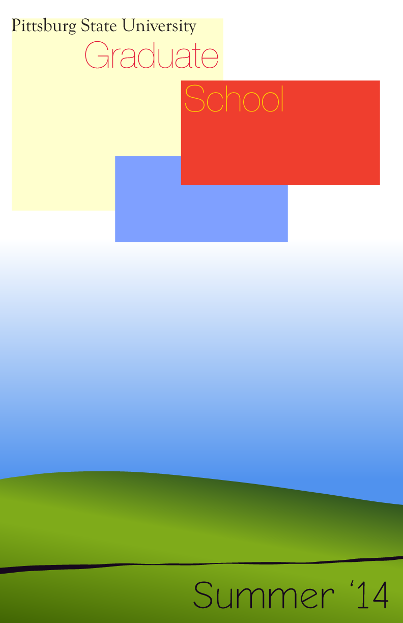
I don’t really know where I was going with this next one, but it has some interesting ideas that I might use in some later designs. This was another one of those free-time projects, and came from an idea to produce a limited print summer poster to encourage people to stop by the office and learn more about graduate school. The Hill at the bottom is inspired by the Windows XP default background. The rest was just messing around with boxes and colors. It’s definitely not a finished product, but I think it’s going in an interesting direction.
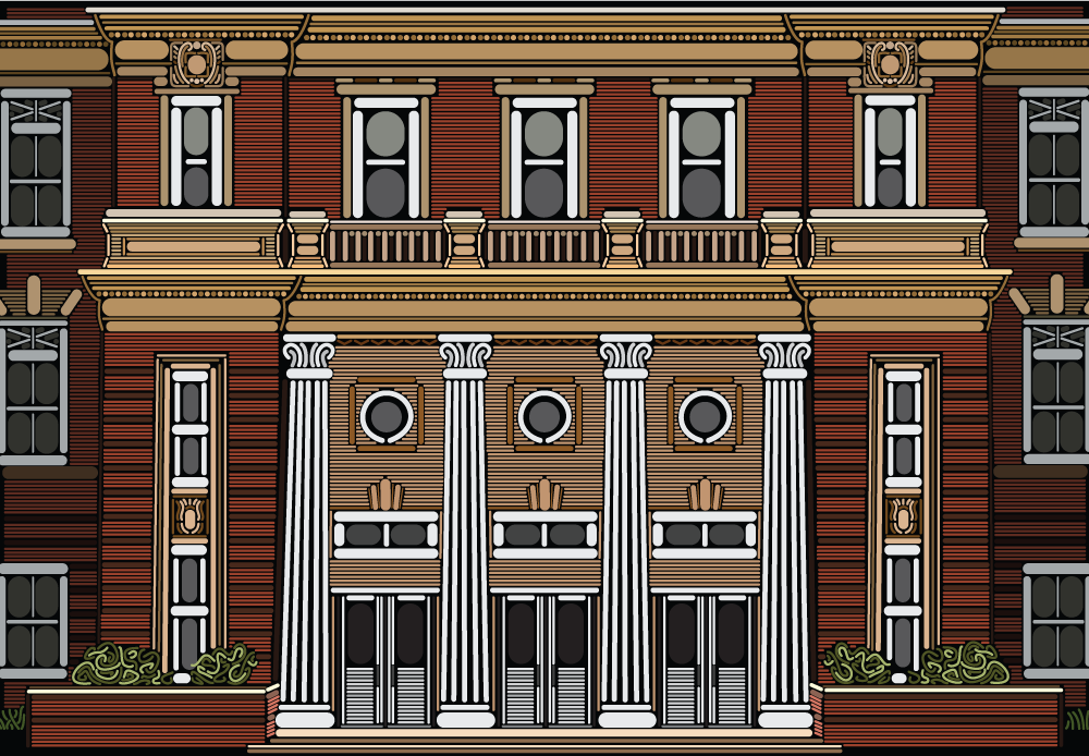
This one is probably my favorite. It’s a line-art representation of Russ Hall the main administrative building on the Pitt State campus. I only made it through this project about as far as it is cropped in this image. The actual building has a 4th floor and is about 3 times as wide as this.
Everything is made using only lines in Illustrator. The circles and ovals have increased stroke thickness to create their shape. I even went as far as to incorporate the details in the carved stone on the building. This too was incorporated into an alternative design of the Graduate viewbook, but was created some time before during brief moments of down time. I had a lot of fun working on this, and I’ll probably continue to develop it until the building is complete.